Wednesday, 1 April 2015

Coping with Painters' Block

    Do you ever get painters' block? You're not sure what to paint next, and nothing seems to be working? I'm lucky, meeting so many interesting people and creatures (yes, it's often those wild things out there that give me so much pleasure when I'm out sketching), that it never seems to bother me. If you are finding it hard to get going again, you can try working on different surfaces - tinted papers, perhaps - or a different medium for a while, to trigger new sensations.

    Think also about changing subject matter. This can be totally different to your usual work, or simple extending it in a way, such as adding wildlife into the middle distance of your landscapes, or more detailed figures than you normally paint. While I mainly paint landscapes, the impact of stunning wildlife stumbling into my scene (and sometimes getting a bit too close for comfort) has encouraged me to paint more wildlife. Boats and the sea are also favourites, bringing a pleasant change to inland scenes, and I love doing figure work in various forms.

    Here, I'd like to talk about another type of subject I find fascinating - the industrial scene. When the coal mines of South Wales were closing down rapidly towards the end of the 20th century I wanted to capture the last of the mines before they all disappeared. This is a watercolour of Penallta Colliery with the miners coming off duty. I didn't want to include all the intricate detail of the pithead and environs so I introduced quite a bit of atmosphere. This also had the advantage of making the figures stand out against the background, and the whole composition was created from several sketches and photographs. This was especially important with regard to the miners who had to relate to each other. Here and there I have deliberately lost detail, but note how the smaller background figures in silhouette really suggest a sense of depth to the painting.

    There tends to be a lot of detritus lying around in a scene like this, but you don't need to put it all in: some of it can either be simply suggested vaguely, or you could leave it out altogether. As always with a complicated scene it is vital to do at least one studio sketch before the painting, to work out the optimum composition. Consider also keeping the background as an almost monochrome as I have done here. This will further throw emphasis onto the foreground.

    Unfortunately Images of the South Wales Mines, the book that resulted from my mining paintings, has long been out of print, but you may be able to get a rather expensive copy secondhand. Most of all, don't let that painters' block stop you - we all get a little stale at times, but trying a different type of subject is often a good way of rejuvenating your artistic impulses.

Saturday, 21 March 2015

Creating a large foreground

    It's some time since I found time to write a blog post - having to work on the studio, being away from home and a recalcitrant computer with an impossible broadband service has made it difficult. The sun is beating down outside and the spring flowers are rife, a marvellous time to be out sketching, so maybe when I finish this post I'll get some fresh air.

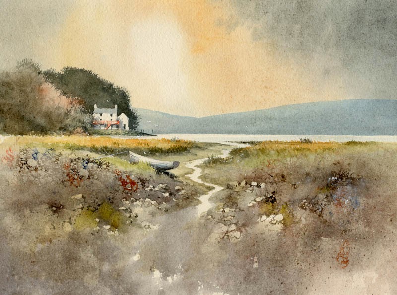
    My subject today is Dylan Thomas's Boathouse  where he wrote his poetry. In this case I have designed the composition so that the foreground plays a major part, covering at least half the area of the painting. This has allowed me a rather long lead-in where I've elongated one of the ditch-like creeks and let it fade into the immediate foreground. With so much foreground space there is a danger that it could be severely over-worked, so I have made the detail intermittent, gradually losing it lower down as a vignette.

    I began rendering the foreground by drawing in the shapes of stones in outline with a fine rigger brush, varying the colour with burnt umber, light red and ultramarine. I then washed a medium tone of French ultramarine and light red over the area, avoiding the stream and light stones, working very quickly with a number ten sable, not worrying if I covered some of the stone images, and losing the edges of others where they were still wet. While this was all wet I dropped in other colours, mainly yellow ochre, and then let the painting dry. Finally I drew in further stones with the rigger - these are the ones that stand out more prominently. I also added touches to some of the light stone shapes to make them stand out.

    This painting is now on display with others at Art Matters in their White Lion Street Gallery in White Lion Street, Tenby in Pembrokeshire. Their telephone number is 01834 843375 if you wish to get in touch, and their site is www.artmatters.org.uk  Enjoy your painting and make sure you give those foregrounds plenty of consideration before you decide on the final composition. Don't be afraid to make them a significant part of the painting, and not just an after-thought.


Tuesday, 24 February 2015

In Praise of the Tea-Pot

    Maintaining morale when out sketching on location is vital, and while some might find a whisky flask useful, I generally rely on tea. Sadly last week in Pembrokeshire the cottage where I stayed lacked that vital ingredient, the teapot. Naturally, this was pretty disastrous, so when out and about I made the most of any such facilities. In the sketch below the right-hand building is a superb tea-shop selling the most delicious cakes, and this is why you might detect a certain hastiness in the rendering of the pencil-work.

    However hasty we may be in sketching, it pays to consider the composition carefully when creating a painting from the sketch or photograph. Unless the subject is quite a simple affair I normally carry out an intermediate studio sketch to work out where I wish to place the important elements and the main emphasis, together with the sort of atmosphere I wish to convey. In this instance I would move the composition to the right a little so that the left-hand house did not appear in the centre of the composition, as this would be my centre of interest. I would need more detail to be included above the left-hand wall and figures (detail missed because of the urgency of the tea situation), so I would have to resort to memory, a photograph, or the good old imagination. The main figures would be placed further to the right, a little closer to the centre of interest, and I would make full use of the dark runnels of water descending from the centre right - I have already bent them slightly to come towards the viewer as a lead-in. These are the kind of thought processes that go through my mind before I begin the painting.

    Don't underestimate the value of tea for the artist. I've even used it on a painting outdoors on occasion. Last autumn while I was running a landscape painting course a lovely German lady was painting a cottage, which filled her paper. When I asked her what was her focal point she replied, "The tea-pot." Sure enough, there was a teapot in the window. Such observations may not only bring a smile to your viewers, but might also result in a sale.

Thursday, 12 February 2015

Reserving whites in a watercolour

    One of the greatest problems concerning the watercolourist is that of reserving whites in a painting. There are several ways of tackling this: the use of the negative painting technique, masking fluid or film, scratching with a knife or scalpel, or the use of Chinese white, white gouache or acrylic. Pulling out colour with a damp brush or tissue, or sponging out when the wash is dry, are further ways of achieving a considerable lightening of the tone, although these latter methods rarely are as glaringly white as the aforementioned ones. Down the centuries white body colour has been employed, the equivalent of our white gouache or Chinese white.

    These days even the main watercolour societies feature paintings carried out with much use of white gouache or acrylic paint, so there is no stigma attached to using that method, and I shall illustrate it in a future blog. Scratching can be effective for minor features such as ropes or rigging in a harbour, limited sparkle on water, and similar items, but for larger or more intricate work masking fluid or the negative painting technique is a better method.

    In the watercolour on the right I applied masking fluid over the actual icefall with all its complexities, in the positions where you see the absolute white. This, of course, is the naked paper after the masking fluid has been removed near the end of the painting. For the snow lying on the peak and crags, and also for the light cloud, I used the negative painting method, that is, I worked round the white shapes with the darker sky, the rocks and shadow areas. When it was all dry I applied further shadow washes using French ultramarine and cadmium red over some of the snow and rock areas that were in shadow. I could have employed masking fluid to some of these parts, but it results in hard edges and much of the edges there I wanted to appear soft, especially the light cloud. I find it best not to mix the two techniques in the same area as it can get confusing, thus causing errors, so I have deliberately kept the top and bottom halves of the composition apart in that sense.

    This is one of the paintings that will appear in my exhibition at the Windrush Gallery from 3rd to 10th May (it will be closed on 7th and 8th May), at Windrush, Gloucestershire, OX18 4TU  Telephone 01451 844425 The gallery open times are from 11 am to 5pm daily. The exhibition will cover a wide variety of scenery, including marine and pastoral paintings. I shall also be doing a watercolour demonstration Painting in the Cooler Months in Windrush village hall on Saturday 9th May at 2pm. If you wish to come along please book in advance:  j.neil299@btinternet.com or phone 01451 844425

Saturday, 31 January 2015

Adding energy into your watercolours

    Artists who work solely from photographs really do miss out on those marvellous energizing sensations of being tossed around in the wind, or being spattered in face and sketchbook by rain, snow, hail, or whatever. These sensations link you with the natural world, and provide a tremendous advantage when you wish to really make your paintings more dynamic and full of movement. But, of course, not everyone wishes to go through such experiences.

    This  section of drystone wall and wind-swept bush is part of a watercolour painting where I began with masking fluid painted over where the stonework would appear. The dark bush throws up a strong tonal contrast with the top of the wall, and after this had dried I removed the masking fluid and brushed a light blue-grey wash over the right-hand end of the wall to subdue that part.

    For the branches I mixed some burnt umber and French ultramarine and applied it with a number 1 rigger. To give a sense of strong wind and movement I painted with vigorous strokes outwards from the centre of the bush. When this was done I spattered a number of small blobs or spots with the same mixture, to further enhance the feeling of robust movement in the branches. With all the branches bent in the same direction it suggests a rather windy day.

    Watch for these effects when you are out and about, and note them, even if you don't have a sketchbook or camera with you. You can, of course, include them in a composition where there is no wind, just to liven things up a but, or to create a sense of movement. This can be really effective on water - I've just returned from a few days in London and when sketching on the Thames the water was alive in the wind, creating a real sense of sparkling movement in the sunshine.

    have a go at this more vigorous approach - it really does give your work a marvellous boost.

Friday, 16 January 2015

Exploiting plastic food wrap in a watercolour

    The first snowfall of the winter arrived on Wednesday, and with glorious sunshine slanting across the landscape I abandoned all work and set off up into the hills. Familiar scenes lay transformed into jewels sparkling in the light. At one point I had a sudden urge to seek out a view at a point I had never stood before, a sort of premonition that I might find something exciting there. It was not far off the path, but about 200 yards across rough dead bracken covered in deep snow - ideal terrain to trip over and get a nice refreshing snow-bath.

     When I reached the point there was no wonderful view, but as I turned back the scene before me really caught my imagination. It was a familiar abandoned house, but from a totally new angle, the whole image enhanced by the deep snow. It certainly brought it home to me that you can often find amazing new scenes simply by approaching the subject from a slightly different viewpoint.

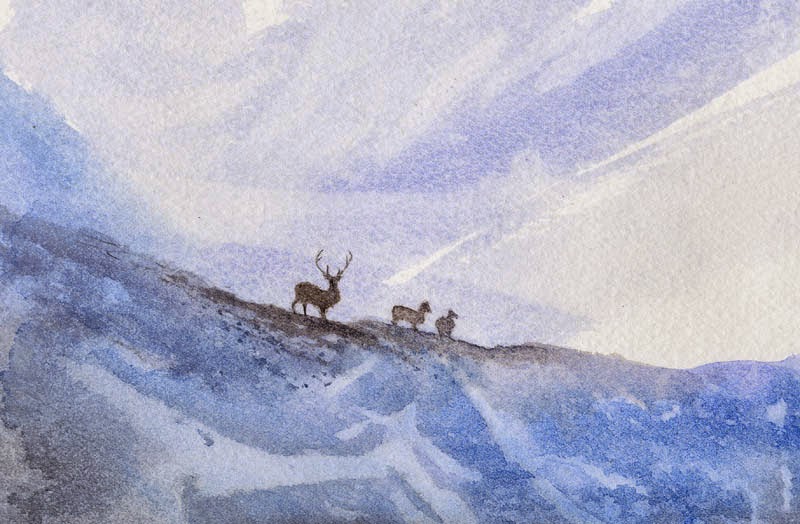
    One technique I sometimes use, mainly for foregrounds is that of covering an extremely wet wash with plastic food wrap, as I did here in the watercolour of highland deer that I came across in Glen Affric. In this instance I used Winsor blue, in places mixed with a touch of cadmium red, and varying the wash so that in places there was less strength in the colour, and even parts without any colour at all. You need to leave the food wrap in place until the wash dries completely. The method gives a spontaneous feel to the finished work. Experiment with various colours. It's great fun to try this without any preliminary pencil work - you can do several examples at once - and when the work has dried you can see the optimum position to place your drawing before doing any further painting, and thus taking optimum opportunity of how the effect has developed.

    This painting appears in my Winter Landscapes in Watercolour book, which you should find especially useful if you enjoy painting snow scenery. It is crammed with tips on how to bring sunshine into your paintings, creating misty effects wet in wet, transforming a scene by altering tonal effects, making the most of warm colours in winter, and much more. If you wrap up well, use a thin pair of gloves and carry one of those vacuum cups with warm coffee, you can make the most of a snow scene caught in the lovely low sunlight of a calm winter's day. Leave the food wrap for the studio though!

Monday, 5 January 2015

Sketching complicated harbours

    It's a tremendous bonus when everything seems to work so well - my Christmas holiday was extended this year by a trip to Devon, and my luck was in: Dartmoor was at its best in frosty conditions with not a cloud in the sky. I was also greeted on the coast with lovely sunshine and some strong atmosphere at times, which suited me down to the ground.

    I carried out a couple of sketches of Teignmouth Harbour in late afternoon lighting, and as it is an extremely detailed scene I really needed to subdue the urge to put everything into the sketch. What really attracted me was how the sunlight and cloud shadow highlighted various aspects of the scene, so this called for patience to wait for the right moment to capture those parts that attracted me. The far hillside was crammed with buildings, so my aim was to use cloud shadow to reduce this overwhelming mass, and also to throw the emphasis onto the white boat. I worked on blue-grey tinted watercolour paper, using white gouache for the highlights, much of the washes being done later. Although some of my houses are a little too large, this matters little in a sketch as the finished work can be corrected. Being selective about what you include in a composition is vital, otherwise the work becomes far too cluttered.

    This paper is kept in loose sheet form in a sketching folder, with several other types of paper, some of which are tinted, some NOT (or cold pressed), rough or hot pressed, and this gives me great flexibility in choosing the right paper for a particular subject. Carrying a pad for each type of paper would probably need a packhorse with me on sketching trips, so think about making up a pack of sheets of your favourite papers when you work away from home, or on holiday. For further guidance on light and atmosphere see my Skies, Light & Atmosphere in Watercolour http://www.davidbellamy.co.uk/shop/52-david-bellamy-s-books

    I hope you all had a great Christmas and wish you much happy painting in the new year.