Friday 23 December 2011

Painting the first snows

    Last Saturday I had my first chance this winter season to get up into the snow-bound mountains. It was lashing with rain, very cold and windy when I set off from home, to the accompaniment of comments which made several references to 'lunacy.' Aha! By the time I reached the Black Mountains the sky appeared even more ferocious, more threatening, the clouds snow-laden and scudding fast, now and then leaving a gap through which some peak was revealed.


   As I geared myself up I barely gave the mountain ridge to the east a second glance. It looked dull and unpromising and I'd seen it in much better light. Hardly had I gone 300 metres when it suddenly exploded into a feast of light and cloud. Gone was the dullness. Within seconds it had become an amazing sight that reminded me of Tangi Ragi Tau, the Himalayan peak I'd painted several years ago, and shown above. I couldn't see the topmost part of the ridge because of cloud, but this added to the mysterious immensity that offered itself as my first sketching subject.

    The rain had gone, but the wind was vicious. I managed several sketches that afternoon, climbing high into the snow and revelling in the beauty all around. The sketch, the photograph and the finished painting will appear in publication in due course, but the lesson of all this is that however familiar you are with a subject, however many times you've seen it, the moment the atmosphere starts to let off fireworks like this you need your sketchbook and your camera.

    I wish all my followers a Happy and peaceful Christmas, and may 2012 be your best ever!

Sunday 18 December 2011

How to paint in the dark

    We're been experiencing some dreadfully gloomy days of late, where even in the middle of the day it's been incredibly dark, which makes painting by natural light impossible. It's hard to see what colour you're using at times. Switching on an ordinary light will produce a warm colour cast which can often end with strange results when eventually you view the finished work in natural daylight.


For as long as I remember, I've been using the marvellous lamps produced by The Daylight Company. The lamps come in many forms - some like a normal angle-poise light, some as short strip-lights as you see in the photograph, some with large magnifying glasses incorporated in the structure - I have several, and their bright, cool light is an ideal substitute for daylight. It's also invaluable when you have to work well into those dark evenings. Another great asset is that when your eyesight is not quite what it used to be these lights do help enormously. For the artist they are a real boon, and The Daylight Company is a pleasure to deal with. Check out their website to view their full range. Craft stores, knitting shops and of course art shops are places to find them, but make sure you see their full range first to make sure you get the lamp that suits you best. Don't let those mid-winter blues get the better of you!

Saturday 10 December 2011

Breaking up monotonous features in a coastal composition

    Where you have strident blocks of cliffs or rocks on the coast they can appear both monotonous and overwhelming unless you break them up somehow. An excellent way to do this is to watch for those dynamic splashes of boisterous surf hitting the rocks and use them to break up the mass of solid rock. I often exaggerate these to a degree so that they can be more effective. This is not cheating as I often come across the most enormous and sometimes terrifying waves smashing up against the shore.


    The illustration shows wild waves crashing against a long rib of rock on the west coast of Pembrokeshire. effectively breaking it up so that it appears as two different blocks of rock. Although it is an original sketch carried out on the spot with a water-soluble graphite pencil, the technique applies equally to a painting in any medium. I had just scrambled down the rocks on the left after exploring the bay on the far side, without getting too wet. The gulls added further dynamism and life to the composition.

    Whether you enjoy working outdoors on location as I do, or prefer to stay indoors, it is worth breaking up features that might otherwise dominate a scene, as in this case. You don't need to completely obliterate the central part of the feature, but it really is worth doing a small thumbnail sketch before you carry out a full painting. That will help you decide how far to go with any changes to the scene.

Monday 5 December 2011

Lost & Found technique in a painting

    In a painting, when you overstate detail you will detract from the impact the work imparts on the viewer.  The answer is to simplify matters by leaving out much detail and lessening the effect of what remains in what we call a 'lost and found' method. This technique is seen quite clearly in the section of a painting of the wall at the home of Witch Coarsecackle, as illustrated below:


    The stonework is only revealed in places, and by washing a transparent glaze over it the otherwise stark edges of the stones have been softened. Also note how the window has been rendered, losing strong detail lower down to stop the whole becoming rather boring. I used the negative painting technique here, but masking fluid might well have been an easier technique. Ignore the rather strange-looking creatures in the top right-hand corner as they add more to the narrative than to the aesthetic appreciation of the lost and found method.

    You will find the 'lost and found' method featured in all my art books, but for further information on Witch Coarsecackle and her amazing abode you can check out The Grog Invasion on my website. It is the first book of the Chronicles of the Llandoddies, the legendary water-folk of Llandrindod Wells, and a great tonic for those who need a good laugh and escape from the realities of modern life, aimed at kids from 9 to 99. Coarsecackle is herself a portrait artist of some renown and a film on her methods is under preparation.

Sunday 27 November 2011

Having fun with your old paintings

     What do you do with those old paintings that end up in a mess and clearly have not worked? Turn them into paper darts? Use the backs for another painting? Frame them and give them to your least favourite aunt for Christmas? Whatever you do, don't tear them up or throw them away as they are more valuable than you may imagine.


    If you keep your old 'failures' in a folder the time will come when you will find them extremely useful to practice techniques. In this scene of Tideswell Moor in the English Peak District you will see a dark cloud on the left with a rain squall beneath it. This was achieved with a glaze - a transparent wash laid over an already-painted part of the composition, once it had completely dried. In this case it was done by wetting the paper first so that a soft edge would be achieved on the falling 'rain'.

    Most inexperienced artists find this glaze technique rather daunting, and of course it is easy to mess up an otherwise competent painting. In order to gain practice with this technique there is nothing better than to do it on your old 'failed' paintings. You have nothing to lose and you might end up with a really good painting after all. The glaze method can be useful for warming up or cooling down a painting or an area within that painting, or for creating shadow or falling rain as in this case where you wish to suggest a film of atmosphere in between the viewer and part of the composition. Have fun with your old paintings!

Sunday 20 November 2011

Critical observation

    When I talk about sketching outdoors I am well aware that so many artists lose interest - they prefer to stay indoors, warm and comfortable and work from photographs, books, calendars and so on. 'Sketching' is a dirty word to many, although for me it is one of the most rewarding things I do. Still, for those of you who don't wish to venture beyond your front door, you can still learn a lot by critical observation.

     This exciting picture was taken in my hotel bedroom last week in London, and if you look carefully you will observe a number of subtle effects concerned with direct and reflected light. The main light is entering through a window to the right, illuminating the right-hand wall and the right-hand edge of the door architrave in the centre, but where this is blocked by an object in the top right-hand corner the most powerful light there comes from the light bulb above the top left-hand corner.

    If you look carefully you should be able to see a slight lightening of the vertical thin strip of wall in the centre where reflected light is bouncing back from the illuminated architrave.  Again, at the bottom of the scene you can see further counterchange on wall and architrave caused by a table in the bottom right-hand corner.

    Simple scenes like this can provide an excellent idea of how light affects various surfaces and angles. You can observe these effects without having to go out into hostile terrain, or the need to do any sketching. Make it a habit whether you are indoors, outdoors, or sitting in a rickshaw waiting for the traffic lights to change.

    In the December issue of Leisure Painter magazine you will find a complete article I wrote on the subject of observation, and I have a further piece on-line at http://www.painters-online.co.uk/  Critical observation like this can also while away the time as you wait for a train or whatever, and it can be great fun!

Tuesday 15 November 2011

Sketching and drawing with watersoluble pencils

    This post is in response to Michael Bailey's comments about the Karisma aquarelle pencils - marvellous watersoluble pencils that were so useful for sketching in all weathers as you can lay on the pencil tone and brush water across it to create lovely washes in various degrees of tone. They enabled you to create lovely, moody pencil sketches and drawings.        

    The rough sketch on the left was done with a medium Karisma pencil many years ago. It shows an ice cave in the Argentiere glacier, with great blocks of ice fallen by the entrance, and gives a fair idea of the variety of tones you can achieve with a watersoluble graphite pencil. You can clearly see the vertical pencil hatching on the side of the large horizontal ice slab where it has not quite washed out.

    When the Karisma range sadly disappeared off our art-shop shelves we looked around for a replacement, and after some experiments found the Caran D'Ache Technalo range to be a good alternative. Like Karisma, the Technalo watersoluble pencils come in a range of three: HB, B and 3B, to give you a light, medium and dark tone.

    Thanks for your kind comments, Michael - I hope this helps. I don't, by the way, normally use these pencils with watercolours to produce paintings as some graphite will always wash off and muddy up the colour, although I have used them as an exercise in one of my earlier books to show tone and then applied light washes to help illustrate a point. They are excellent tools for learning about tones.

Saturday 12 November 2011

Eilean Donan Castle as a watercolour monochrome painting

    Many inexperienced artists find that coming to terms with tones, colour mixing and the myriads of other complications with watercolour painting is so overwhelming that they almost feel like giving up. If you suffer from this syndrome then try working in monochrome for a while. This will greatly improve your tonal evaluation and get you back on the rails once more.


    By using just one colour throughout the painting you can concentrate on getting the tones right and not have to concern yourself with any of that nasty colour mixing that confounds so many. As usual, build up the watercolour starting with the lightest tones and gradually bringing in the darker ones. Try a dark colour such as indigo, Payne's grey, burnt umber or warm sepia, though I have to be in a truly bad mood to use the latter as it's such a depressing colour.

    The painting shown above shows the Eilean Donan castle in the Western Highlands of Scotland, which was featured in one of my very early books. It was carried out on tinted paper and is a lovely example of creating a landscape composition without resorting to colour. Monochrome also has the advantage of creating a sense of unity and mood. After a few monochromes try adding a second colour, gradually bringing in more colours once you feel more confident.

    There is a useful section on monochrome painting in my paperback Learn to Paint Watercolour Landscapes available from http://davidbellamy.co.uk/

Tuesday 1 November 2011

Waterfalls and rocks in watercolour

    Waterfalls make marvellous subjects for the landscape painter, and are often close to the road, as is this one, the Ogwen Falls in Snowdonia, one of my favourites. As they are marked on Ordnance Survey maps of 1:50,000 scale they tend to be easy to find. These falls are spectacular, but rather complicated for the inexperienced artist, with so many rocks and separate cascades of tumbling water. You need to leave out many of these, keeping it simple by only including the most shapely and important rocks. If you go there after half a day of heavy rain most of these rocks will be submerged anyway.

    Bear in mind that when painting waterfalls the secret is to create effective contrasts: those of hard-edged rocks sticking out of the water, or where the water tumbles behind them, and also the soft edges of falling water. The other type of strong contrasts is that of the white, aerated water crashing down beside the dark, wet rocks, but watch out for those rocks that escape the splashes and perhaps have a little colour to relieve the overall black and white effect. I always like to include some vegetation in a waterfall painting, as it breaks up the mass of rocks and cliffs, and can add a little colour to the scene.

    This watercolour is featured in my exhibition currently taking place at Siop-y-Siswrn in Mold, a few leagues into North Wales to the west of Chester. It covers not just mountain scenery, but gentler pastoral landscapes and coastal scenes. The gallery is open every day except Thursday and Sunday, from 9.30 am to 4.30 pm, at 6 - 8 New Street, Mold, Clwyd. The telephone number for Siop-y-Siswrn is 01352 753200

Friday 21 October 2011

Drawing action figures

    One of my great enjoyments is drawing and painting the figure, especially the one in action. Life drawing is the finest way of improving your drawing skills, and even now I wish I could do more. During my years of active caving figure work became more important, for without the figure in a cave you get no sense of scale. Sometimes we posed for each other in some climbing/caving position, but some of the best work I did involved catching views of cavers as they struggled through difficult features of the passage. For some reason many seemed reluctant to maintain a difficult pose when perched 80 or 100 feet above a sheer drop with their only means of support being that of thrusting their limbs out to jam themselves in position: no holds, and smooth wet rock. For the artist such a pose can be so dynamic, so tense, and with a look of absolute concentration on the model's face. Jenny was especially good at it.

    To the left is a page out of my sketchbook, showing a caver preparing for a rope-climbing competition, an excellent time to get all manner of models. I draw rapidly, making many mistakes, but every now and then one will succeed. many are abandoned as the model moves away from a certain pose, but with perseverance and practice you will find it becomes easier. Usually the model repeats poses, so that you can go back to an earlier unfinished drawing and continue.

    In a caving environment I often have to work so fast that as cavers move through the passage I only have time to do a leg or arm, so end up with the left leg of one caver, the right of another, the nose of a third, and so one......great fun! It's a bit of a problem when someone says afterwards "You've caught me really well there," knowing full well that not only was that someone else's left whatsit, but that someone else was of the opposite sex!

    At the moment I'm working on artwork for the next Llandoddies book which is crammed with action figures, not to mention a few monsters, so all this practice and recording is paying dividends. I try to capture characters at all opportunities - the London underground is an excellent place, cafes and restaurants also make fine ambush points, and any large event where you can wander around and do some candid sketching. So naturally, it always pays to have that sketchbook on you, perhaps hidden within the pages of The Times or Playboy, as the mood suits you. It's quite surprising the number of monsters that you come across in your day-to-day travels!

Sunday 16 October 2011

Creating space & distance in landscape paintings

    One aspect of landscape painting that causes a few problems for the less experienced artist is that of suggesting a sense of space and distance. This is especially a problem where the air is clear and you can see everything in outstanding detail for miles, thus tempting us to put everything into the composition, in quite strong detail. We usually need to create something of an atmospheric haze, sometimes within a short distance, in order to create a feeling of depth and space in a painting.


    The key to creating a feeling of distance in a landscape painting is to ensure that the more distant feature has less detail, less colour strength and less tonal strength than that which it is in front of that feature. In this small part of a watercolour you can see that the left-hand mountain slope is quite a bit stronger in tone and detail than the ridge disappearing behind it, and this applies to trees, buildings and all manner of features. Make sure that there is very little detail in the more distant feature as it goes behind the closer one, otherwise this will confuse matters.

    The above picture is part of my painting of Glen Feshie, in the Cairngorms of the Scottish Highlands, and is currently on display in my exhibition at Lincoln Joyce Fine Art, at 40 Church Road, Great Bookham, Surrey. Telephone 01372 458481, which continues until the 22nd October

Sunday 9 October 2011

Granulating Watercolours

    I've always loved colours that granulate - that is, create a varied speckling across the wash which had traditionally been present in certain pigments such as French ultramarine and cobalt blue, for instance. This summer, my attention was drawn to the Daniel Smith watercolours which are imported from America, as so many of the colours in an extraordinarily large range tend to granulate.

    In this small section of a watercolour painting you can clearly see the strong granulating effect in the sky area. This colour is Zoisite Genuine, a grey-green that is especially useful for mixing subtle greens by adding one of the yellows to the mixture. It also has a slight tendency to intermittent sparkle when caught in a certain light, and is excellent for those areas you wish to play down, yet retain a little interest in the form of the granulations.

    Moonglow is another colour that granulates well, a deep violet that would be ideal if you need a 'mysterious dark' with a little warmth. Whilst it may be an exciting addition to your halloween paintings, it could inject some lovely moody atmosphere into your landscapes, and I look forward to experimenting further with it.

    Another exciting colour is Quinacridone Deep Gold which can impart a glorious rich glow to your skies, autumn scenes, or many other applications in a painting, and if you want intensely blue summer skies the Daniel Smith Manganese Blue is a knock-out. I should also point out to those who like Yellow Ochre, but not its opacity, that in this range the pigment is transparent!

    I've only tried a few of the colours in this range, but from what I've seen they do give exciting possibilities. As artists we should always be on the look-out for new colours to try out. You can buy test sheets of the whole range and these contain a small blob of colour of each pigment that you can try out. Many of the colours are metallic, they shimmer and sparkle, so not all are suitable for traditional watercolour painting, but if you wish to look further see http://www.premiumartbrands.com

Sunday 2 October 2011

Exhibition of watercolour paintings

    Wednesday 5th October sees the start of my major 2011 exhibition, From Mountains to the Sea, at Lincoln Joyce Fine Art in Great Bookham, Surrey. The subjects range from coastal scenes, rural landscapes to the high mountains, with a number of overseas locations included. Naturally the mood of a place is a strong feature in each watercolour, as has always been one of my prime aims in depicting the landscape.


    One of the paintings is this view of a farm in Upper Langdale in the Lake District, the tops dusted with a thin layer of snow which strongly contrasts the red of the dead bracken on the mountainside. This was painted from a sketch I carried out many years ago, for I have so many sketches and photographs that I can quite happily put many good ones aside for some time until I feel the moment is right. The only thing that was not actually present when I did the sketch is the group of chickens - these were taken from another source, and it pays to have secondary visual resources like this to beef up a composition, however good the original may be.

    The exhibition runs until 22nd October and Lincoln Joyce Fine Art can be found at 40 Church Road, Great Bookham, Surrey, KT23 3PW, telephone 01372 458481 I shall be there on Wednesday 5th October to conduct the watercolour seminar in the hall opposite. We still have a few places left if you'd like to join us for the demonstration and talk on Skies, Light & Atmosphere, in which case it is advisable to ring the gallery (above) and ask for a ticket to be kept aside for you to pick up on the day. For details see http://www.davidbellamy.co.uk/

Wednesday 28 September 2011

Painting view blocked by a mounted army

    How often have you been out sketching or painting a favourite view, when just after you've put brush to paper a dirty great truck comes along and parks right in the way of your view? It's pretty frustrating, though up in the mountains I'm normally spared that sort of thing, apart from a very occasional helicopter making a nuisance of itself.


    It's a right turn-up though when you find your subject blocked by an army of mounted knights, all in full armour with shields, swords, spears and helmets gleaming in the sunshine. The best weapon I was carrying was a number ten round sable, not much use against that crowd! Luckily, Marloes Beach is huge and when the tide is out there is plenty of room even for several hundred knights together with several hundred artists, if it came to the push, so Jenny and I drifted off to the south end of the beach and found a superb subject set against a delightful, shimmering sea.


Friday 23 September 2011

Painting holiday in Iceland

    Next June I shall be taking a group of painters to Iceland to paint and sketch the amazing landscapes there, ranging from the most spectacular waterfalls that take your breath away, to violently-coloured mountainscapes that will challenge your palette, sublime ice and glacier scenery, the blackest of lava and so much more. Truly "Lord of the Rings" stuff that promises to be a visual feast.


    When I was last exploring Iceland I camped much of the time, and of course, always take every opportunity to sketch people as well as the landscape and wildlife. At one site this lady Viking passed our tent carrying an armful of lager cans, so I couldn't resist a quick rendering in my sketchbook. My companions sometimes get rather concerned when I do this, as they know full well that the result is not always complimentary, but not many people realise they are being studied in this way.

    Next year we will not be camping, as it's quite a luxurious trip as far as accommodation is concerned, and I can't guarantee we'll bump into any lady Vikings, but I'm sure there will be plenty of interesting characters around. Many Icelandic artists themselves include odd characters in their landscape paintings, some quite mythical. If you are interested in the painting holiday do get in touch with Liz Drake at http://www.spencerscott.co.uk  telephone 01825 714310  or  info@spencerscott.co.uk

Friday 16 September 2011

Painting skies, light & atmosphere

    Skies, Light & Atmosphere is the theme of my watercolour demonstration and seminar at Great Bookham in Surrey on 5th October, three inter-linked elements that play such important parts in landscape painting. The event features a demonstration followed by a coffee break and then an illustrated talk covering a multitude of scenes showing techniques for achieving a great many effects for skies and atmosphere, and how to make the most of the light in a variety of forms.


    This watercolour of the lovely old village of Bradwell in Derbyshire embraces all three of the elements I shall be covering in the seminar. Early morning mist creates an atmosphere that loses a great deal of background detail, aided by smoke drifting up from the chimneys, while the backlighting lends itself to a dramatic effect, the figures caught in the sunlight have haloes around them - achieved by leaving the immediate surrounding rim of their bodies as untouched white paper.

    The most intense light in the sky is also untouched paper, as are the silver linings, the rims at the edge of some of the clouds close to the sun. Much of the sky has been rendered with a wash of French ultramarine mixed with cadmiun red, and this has also been taken down into the background behind the immediate houses, thus retaining a sense of moody unity which a lot of conflicting colours would destroy.

    My exhibition starts on 5th October at the Lincoln Joyce Fine Art gallery at 40 Church Road, Great Bookham in Surrey on the same day as the seminar which takes place in the hall opposite the gallery. The gallery telephone number is 01372 458481. The seminar starts at 1pm, although doors will be open at 11 am for a discount sale of art materials, books, etc. Entry is by ticket only and you can book online at http://www.davidbellamy.co.uk/  Click on seminar tickets in shop menu.

Tuesday 13 September 2011

Sketching in high winds

    It's been rather difficult of late trying to set up postings: slowness of the laptop, repetitive errors, plus the fact that I've been away. Sketching all the lovely mud on the Kent coast in pouring rain, doing stage-by-stage paintings at Search Press for my next book, Skies, Light & Atmosphere, attending a British Mountaineering Council conference on wind energy, crossing a bog in Snowdonia with violent headwinds that hardly improved the sketching, and setting up an exhibition in Aberglasney Gardens near Llandeilo. It takes my breath away just recalling it all.

     Our exhibition is by four artists - Wendy Powell-Jones, Anthony Richards, Jenny Keal and myself, and is on until 22nd September. Aberglasney is a few miles west of Llandeilo in Carmarthenshire, in lovely rolling countryside. Come and see the gardens at the same time, and they have an excellent cafe. Jenny will be there on Thursday 15th.

    Wind tends to be one of the most awkward conditions to sketch in, and the ferocious gusts up high on the mountains in Snowdonia made it extremely difficult, with pencil marks going everywhere except the intended place. Crossing stepping stones at one point was quite entertaining, as not only were they submerged under deep water, but balance in those gusts was somewhat tricky. Not a good weekend to be out on the hills!

Wednesday 7 September 2011

Including wildlife in your landscape paintings

    Sometimes you may come across a lovely spot to paint, a truly heartening scene, but without an actual focal point. Without that important ingredient it is unlikely to be a great success as a composition, so what do you do? There are a number of answers to this question, and one of my favourites is to add wildlife, usually in a manner that allows the landscape to dominate, unless the wildlife is something iconic such as a polar bear, rhino or similar large creature, but we rarely find any of these around the Brecon Beacons where I do much of my sketching!


   While this is only the central part of the watercolour, I have focussed at this point to illustrate how to suggest rapid movement in wildlife by softening off the edges of the birds in places such as the wing-tips, the trailing edges of the wings and the tails, while keeping the beaks and heads in reasonably sharp focus. This was one place where I appreciated having other people and their dogs around, as they caused the birds to fly off in sudden bursts, thus giving me the opportunity to sketch and photograph the action as they flew past.

    I shall return to the issue of highlighting and creating centres of interest within a scene in some future blogs, but capturing fleeting moments of wildlife can be an exciting part of our work, even for landscape painters.

Saturday 27 August 2011

Painting an old goat

    Increasingly I'm including more animals and figures into my landscape paintings, as they do create added interest and life, usually becoming the centre of attention within the composition. This interest in adding more life coincided with my visits to the Arctic with its fascinating wildlife, and it certainly pays to take every opportunity to capture animals and birds whenever you can......on paper that is! many of my more entertaining, and sometimes hair-raising moments have occurred because of wildlife, which can be quite unpredictable.


    In this detail from a watercolour of Bedouin goats I've created a main group in the foreground, with two other more distant pairs that are less detailed than those at the front. By over-lapping most of them it suggests a more natural situation, and of course makes it easier to paint - you can even get away with painting a one-legged goat! The danger with over-lapping is that the detail of the two animals can confuse the eye, but if you look at the leftmost pair you will see how I've faded out the detail of the goat that stands behind the other.

    When there is a herd, flock or whatever, how many animals do you put into the composition? In the 18th century the Reverend William Gilpin propounded that the optimum number of cows to put into a painting was 22, but of course you might not have room for so many, and anyway might get bored after the first eleven or so. I rarely put in more than seven unless they are far away within the picture. Try not to cover the foreground area evenly with one animal per three inches, or whatever: every painting needs its quiet moments.

Sunday 21 August 2011

Painting undergrowth and other thorny problems

    When it comes to undergrowth we can quite literally find ourselves with quite a thorny problem, and painting it seems no easier: how do you cope with all those similar, repetitive and often mundane shapes? Firstly, don't dismiss those mundane bits of a scene: in a composition we need quiet, mundane passages in order to make the exciting bits stand out, so they are important parts of a painting. Secondly, when you are out in the countryside don't forget to gather material like this for use in a painting, in sketch and photographic form. Now and again concentrate on these less dramatic features and deliberately record them carefully.


    This photograph taken on Strumble Head in gentle spring sunshine will give you an idea of what I mean by recording the less dramatic. Posts, boulders, a dry-stone wall can break up the mass of undergrowth, as can a gate, tree, bush, rusty farm machinery, and so on. The undergrowth serves the extremely useful purpose of creating a lost-and-found effect here for the wall, which can look too strident if standing up above the ground by itself.

    Of course the wild tangle of vegetation needs simplification by reducing it to fewer detailed shapes. Make some of the grasses and briars stand out more than others. With vegetation the spatter technique of splashing blobs of paint from a brush can work very effectively. If you wish to beef it up, as you will do from time to time, one of the best methods is to introduce more variety of colour - red and orange can be particularly striking and I often carry this out by dropping these colours into an area that I've already wetted with clean water. Substitute detail with colour. There is more on tackling vegetation in my Complete Guide to Watercolour Painting.

Tuesday 16 August 2011

Painting reflections in still water

     Ongoing at the moment is an exhibition of watercolours and pastels by Jenny Keal and myself at the Wyeside Arts Centre in Builth Wells, Powys. It covers a wide range of landscape subjects, plus a number of flower paintings, and at the moment the opening hours are mainly in the evenings when the venue is open for showing films, from 5.30 pm to 9 pm. For further information and to check opening times telephone 01982 552555


     One of the watercolours on show at Wyeside is this one of Garreg-Ddu reservoir in the Elan Valley, viewed from high up on a hill. The painting illustrates well the impact of keeping reflections simple. This effect was carried out by liberally wetting the lake area with clean water, then washing in a light tone of blue-grey to suggest the general reflections of the hillsides. Then with a stronger mixture of the same colour, and hardly any water on the fine brush, the reflection shapes of the trees was painted into the still-wet surface, creating a lovely soft effect.

    I then took a small flat brush and while the surface remained damp I pulled out the light reflection of the light crag, just to the immediate left of the dark reflection of the conifers. Full mirror-like reflections in still water lose their attraction because they become so detailed, so remember to keep them simple! You can see this painting in my book David Bellamy's Mountains & Moorlands in Watercolour, and signed copies are available from our website

Saturday 13 August 2011

The panoramic sketch-book

    When I go off on expedition I like to take a variety of papers - several sketchpads, plus a folder of various papers, some of which are tinted, and with a variety of surfaces. Occasionally I will use a specialist pad, especially when working near home, and an excellent sketchbook that has only recently come on the market is the Derwent Panoramic book. I've started using it for certain types of subject, and it has a lovely smooth surface of 165 gsm and can be used for watercolour sketching.


    This simple watercolour sketch was carried out as a demonstration on a painting course. The panoramic format is particularly useful for extended mountain ranges and coastlines when a normal sketchbook often means you need to turn over a page halfway across a sketch and add the annotation 'PTO' (please turn over), which is hardly satisfactory. With this sketchbook it really makes you think about how you are going to arrange the composition before you start.

    Another great bonus is that there is not really much room for over-working those nasty foregrounds that seem to give so many of us problems. It encourages us to play down the detail. If I know there is a chance of my needing a book of this format I stick it in the rucsack. Details can be obtained from the Derwent Pencil Company.

Monday 8 August 2011

Nude figure drawing in glacial streams

    Drawing from life is the best thing you can do to improve your drawing skills.....after all, if you can render a good likeness of the human figure where all the legs, arms and other paraphernalia should really all go in pretty specific places, then by comparison drawing a tree should be fairly problem-free. You only need to be vaguely accurate with the branches, for example, provided they are actually attached to the tree-trunk!


    It is, however, rare that you get the opportunity to do some alfresco nude studies, especially at over 6,000 feet altitude as in this case where the model was bathing in water streaming off the Vignemale glacier! Whilst this has happened to me a few times, this is the only occasion that I've had the opportunity to carry out a nude study at such a high altitude.

    The main lesson in this is not only that this sort of thing is excellent practice for you (drawing nude figures, I mean, not jumping naked into freezing lakes), but that it always pays to have your sketchbook with you and be prepared for all eventualities. You never know who or what is round the corner! You will find further advice on drawing the figure in my book David Bellamy's Complete Guide to Watercolour Painting as seen on my website. One final piece of advice: wherever you are always ask permission before sketching or photographing anyone, especially when they are scantily clad or not clad at all.

Friday 5 August 2011

Suggesting detail in watercolour landscapes

     Last month Watercolour Journey left a comment about my paintings "suggesting a lot of detail without actually cluttering up the painting," and I wanted to follow this interesting point with an example to help you. Not just to prove that I read your comments, for they are invaluable in providing both feedback and ideas for further posts, even if my response time is rather long, but I was in Switzerland at the time enjoying the fantastic mountain scenery.


     This is a small part of a watercolour of a scene in the Cairngorms mountains in Scotland and the point I wish to focus on is the mountainside in the background which I have tried to suggest as rough detail. Unlike the loch and trees, this is not one of the most picturesque aspects of the scene, so I wanted to play it down and not clutter up the area immediately behind the trees, yet still give a sense of place.

     At the top of the mountain the detail stands out more strongly where I have deliberately painted in rock and crag shapes, then dragged dry-brush colour down behind the trees. This is an excellent method for suggesting detail without actually painting any in, and it still allows the trees to stand out strongly. Note that the direction of the brush-strokes is designed to enhance the direction of fall of the mountain-slopes. Before I painted in all this suggestion of distant detail I did lay a weak blue wash over the background and let it dry, and you can see it through the broken colour.

     To see more of this painting of Loch Pityoulish see my book Painting Mountains & Moorlands in Watercolour and you can order a signed copy from my website.

Saturday 30 July 2011

Dirt, dust and watercolour: paintings of coal mines

    I have always been fascinated by industrial subjects and they make an excellent change from landscapes, especially if you feel yourself getting into a rut. Many years ago I wrote a book Images of the South Wales Mines, and did quite a lot of work in and around the mines at the time when they were being closed down as the government of the day wrought its vengeance on the mining industry. Now all deep mining has ended in Wales and I have been working on a few more paintings of this vanished era.


     The painting is a watercolour and charcoal work of Marine Colliery, Cwm, showing a coal train getting up steam. When it comes to painting industrial subjects I am a great fan of dirt, dust and steam, as it not only can create instant atmosphere, but can hide the bits you don't want people to see. This is especially useful where you are painting a scene that no longer exists, and are not sure about what exactly went where! While this was not true of the painting depicted, I have used the ploy in other situations, so if you are painting such scenes do make full use of the dirt and dust.

     This is one of a collection of paintings that will be on display at the Corner House Gallery at 38 Quay Street, Ammanford in Carmarthenshire. Tel. 01269 594959  They will be exhibited from the afternoon of Thursday 4th August onwards, and I shall be there on that afternoon, so do come along and have a chat. To see some of the paintings in the collection click here.

Sunday 24 July 2011

Painting Greens in the Summer Landscape

    Summer is a lovely time of the year to be out sketching and painting in the countryside and it is hard to beat sitting beside a babbling brook with your picnic and at the same time painting the water sparkling and dancing in the sunlight. However, when confronted with so much greenery in a profusion of varied greens many artists find it quite overwhelming.


     This small watercolour of a Derbyshire hay meadow is featured in my article on painting summer landscapes in the current issue (August) of Leisure Painter magazine which covers the three different approaches to tackling greens as well as mixing your greens. Often, though, not everything we see as being green is actually that colour. Grass-heads are often a different colour to their stems and you see the effect of a mass of warm-coloured grass-tops in the painting above in the horizontal band just below the cottage. In the tree shadow areas and much of the foreground detail the darks have been created with a mixture of French ultramarine plus either burnt umber or raw umber, not green.

    Try not to have too many different greens in your composition: if you attempt to emulate every green you see before you the painting will become too disparate and messy. Bring more blues and greys into the more distant green areas, as this will not only relieve the overwhelming sight of so much green, but will also suggest a greater sense of distance and space.

    There is much more on the subject in the article, and you will also find further advice on the subject in my DVD Painting Summer Landscapes, produced by APV Films, and available from my website

     For something completely different see the Forthcoming Events page on this blog for my landscape paintings at the Welsh National Eisteddfod, and mining paintings at Corner House Gallery. Painting coal mines is the perfect antidote to those summer greens, of course!

Wednesday 20 July 2011

Jenny Keal Landscape painting demonstration

     For those who love to paint landscapes and are keen to improve their work, they can do no better than to pop round to Erwood Station Craft Centre on Saturday afternoon (24th July) to see a demonstration by Jenny. She is one of the finest tutors on landscape painting around, and does an excellent demonstration. Unlike many demonstrators she paints a different subject every time and is eager to help students with their work.

     While Jenny works mainly in pastel, a great deal of her advice applies to all mediums, so even if you work in watercolours, oils or acrylics, do come along and see her in action. She is also keen to help those artists who enjoy working in pastel, but find the pastel dust a problem - she has excellent techniques for coping with this, and is happy to answer your questions.

     She will be at the centre from mid-day onwards and will be signing her new book. Her demonstration will begin at 2 pm, and you will be able to see her superb exhibition at the same time. Erwood Craft Centre is a lovely place to visit, not just for the paintings and crafts, but they do excellent teas and there is a lovely riverside walk along the Wye. Their telephone number is 01982 560674

Tuesday 19 July 2011

Things to do with your sketching companions

     One of the problems faced by many artists who work out of doors is that of companions: what do you do with them when you want to sketch? Finding one who paints can be a great bonus and I'm lucky having Jenny who also loves sketching, so for much of the time we work outdoors together. In the high mountains, though, it's not so easy for her. So apart from my solo trips I try to get Catherine to join me - she's used to her old Dad stopping in the most odd places to spend time sketching and painting.


     As usual she brought along a large book to read during our recent visit to the Swiss Alps, although in this photograph of her on a lofty crag opposite the Eiger she's just put it away as we prepare to move on. But what do you do if your companion doesn't like reading? Some of the ruses I've tried over the years with various non-painting companions have been:
  • On a cold, snowy morning provide a hot drink and mince pies on a walk;
  • Plan a route with many interesting places to distract them - I managed four churches in the space of two miles once, which kept everyone happy while I sketched;
  • Take a load of goodies to eat that are wrapped in the most incredibly difficult style that will take them ages to open, and thus give you plenty of time to get the sketch done;
  • Deliberately get 'lost' for a while by dodging down behind a wall, bush, rock or whatever is available;
  • I find that 'consulting a tree' (or boulder) is a great excuse to give you a few moments, as no-one is likely to stay with you, although you can't stretch credibility too long!
  • One very effective ruse is to stop and relate some tale or legend that relates to that particular spot and at the same time do the sketch. Too much of this, however, will attract suspicions.   
    These are just a few of a great many devices to keep your companions happy whilst you sketch or paint. With a little preparation before you go it can become quite sophisticated, and no doubt you'll have many ruses of your own. This is just a start. There is a further bonus in all this: it can be screamingly funny at times, concocting these wheezes, so much so that at times I've almost laughed myself senseless and been totally incapable of doing a sketch................

Monday 11 July 2011

Creating a Sense of Scale in a Mountain Painting

     Most mountain paintings benefit from a sense of space and scale - we need to make them look huge and impressive whether they are a backdrop to a valley scene, or viewed from high up. In this watercolour of the Brenva Arete in the French Alps the cool colours make the distant features recede into the distance, helped by the warm red introduced into the left-hand pinnacles.


    What really emphasises the sense of vastness, however, are the three small figures that you can see crossing the glacier on the left, just above the savage-looking crevasses. By including figures in your mountain paintings you can achieve this quality of space and scale, but be sure to make them small. Giants in the foreground will simply have the opposite affect!

    In the previous blog you were asked to think about the position of the dhow. The reason I placed it in that position was because it is pointing towards the centre-line of the painting, and not 'sailing' or 'looking' out of it. The same treatment should be given to people, animals, vehicles, or whatever, as the viewer's eye is distracted by these seemingly innocuous aberrations.

Thursday 7 July 2011

Painting in the Middle East

    One of my favourite painting places is the Middle East, with all its colour and exciting desert scenery, and of course some of the most hospitable people in the world. Unlike many locations, I find it almost imperative to include figures, and much of the time you don't have to paint those dreadful legs on people, as most wear a djellabah or dishdash. However, in this painting I'm not going to show any people as the scene is viewed from the sea.

    This is Mutrah fort in Oman, with a typical dhow anchored in the harbour. Note how the mountains are almost a monochrome - this pushes them back on to a different plane from the fort and dhow, and is a useful device for throwing the emphasis on certain parts of a painting. Treatment of the sea has been achieved by painting little horizontal flecks of ultramarine and cadmium red across the area, gradually making them slightly larger as they approach the viewer. When this was done I laid a weak wash of the same colour right across the foreground. This softened off the edges of the flecks and made them appear more unified.

     Now look hard at the dhow. What do you think I took into account when I considered where to place it? The answer is a useful compositional trick. No marks for comments such as "after much deliberation you decided not to stick it on top of the mountain." The answer will be in the next posting, so you've plenty of time to think about it. Enjoy your painting!!

Sunday 3 July 2011

Thanks to Old Proggie you can now leave comments

   HI!!!  This is Old Proggie - you'll know me if you've read The Grog Invasion, the first volume in the definitive guide to the Chronicles of the Llandoddies. Anyway, old Bellamy has packed his lederhosen and pencils, and is making his way to the Swiss Alps, leaving me in charge of the blog.....well, plus Jenny and numerous clockwork penguins of course, but while she's in the garden I have free rein.

    None of that poncy art stuff here, I'm afraid, unless you regard me (see left) as a rather dashing work of art. No, being the brains behind it all, I shall be trying to improve matters for the blognoscenti. I see that some of you are not able to leave comments so I've done some investigating, and already I've found that the old fool hasn't been clicking some of his buttons properly. So now anyone should be able to make comments (give him some cheek!), not just registered users of the blog.

    I also thought some psychedelic fairies would enhance the blog masthead, and perhaps add a View a complete profile of Old Proggie page, so watch this space. Trouble is, he'll change it all when he gets back...........

Saturday 2 July 2011

Painting With Pastels Exhibition

    Jenny's exhibition has just started at Erwood Station Craft Centre, in the new carriage gallery. It will be open every day from 9.30 to 5.30 until 18th August, and she will be demonstrating there on 23rd July - see the events page. Set in the lovely upper Wye Valley the centre makes a lovely day out to see arts, crafts and beautiful countryside. Michael Cunningham is taking the Centre from strength to strength. This, of course is Llandoddie land, so be prepared for mysterious happenings, such as the cat changing colour.


     The exhibition features paintings from Jenny's new book, Painting With Pastels, published by Search Press, and shows the great versatility of the pastel medium. In her painting of Lindisfarne, seen above, I love the soft blending of the foreground vegetation into the sea, together with the variegated colour and the occasional blob. It is so easy to over-work a foreground, but one of her lessons here is to show how to understate this vital part of a painting.

    We sketched this scene together on a beautiful evening, looking across at the incoming tide, so I'm not surprised that she has emphasised the romantic nature of the moment, and it is this sense of mood, whether emotional or physical, that can inject that marvellous added ingredient to lift the painting beyond simply a graphic record of the moment.

    For details of the book, which is on offer with her latest pastel painting DVD, see our website http://wwwdavidbellamy.co.uk/

Thursday 30 June 2011

Rambling on in Mid-Wales

    For a number of years I have been president of Powys Area Ramblers - part of the Ramblers' Association, which I joined over 20 years ago. It has given me great pleasure supporting a charity that does such marvellous work keeping so many of our footpaths open, and at the same time campaigning on behalf of the countryside, although I tended not to walk with them as my rather odd habit of continually chasing sketches meant that we quickly lost each other......


    Of late, though, things have sadly gone awry in the Welsh Ramblers, with the Welsh RA hierarchy co-opting a controversial new Welsh president in a secretive and what some members feel to be an unconstitutional manner, as it should have been done at an AGM. The new president is Jane Davidson, a former minister within the Welsh Assembly who has been encouraging the building of massed wind turbines across Mid-Wales, industrialising it so much that if most developments proceed there will hardly be a single view without these massive, out-of-scale turbines present. Last autumn, following rumours, I warned Welsh RA that such an appointment would be both controversial and damaging to the RA.

     As far as I know, most members of the RA in Wales are not aware of the arrogant manner in which this decision was carried out, and already some are concerned that they may be unable to protest against wind turbines because of the president's stance. This, of course is not true, but illustrates the potentially invidious effect of having a politician involved in a democratic society.

    So sadly I have resigned my position as president of Powys Ramblers. They are a great bunch and I wish them well, but they, and others deserve a far better hierarchy at Welsh HQ than the present incumbents.

   The watercolour shows typical Mid-wales scenery that will become industrialised before long if the controversial plans go ahead. How soon before this becomes an artistic no-go area?

Saturday 25 June 2011

Painting Course in Derbyshire

    There were much fewer art instruction books around when I began painting, but one of them gave me to most marvellous advice which I have followed to this day: "The best art tutor you will ever find is Mother Nature." After so many years painting professionally I could not agree more. There is nothing like getting out into the landscape and working direct from the scene in front of you.


    In the photo I am giving instruction to a student on my recent painting course in the Derby shire Peak District. This combination of working directly from the landscape with a tutor to guide you really does push your work forward dramatically. Sure, you still don't get it right first time, but it is amazing how much you learn simply by being out there, and gradually your work improves. Before going out students are given a talk on working outdoors, including materials, what to look for as a subject, methods of working, figuring out the composing, and so much more.

    The course was based at the superb Pear Tree Farm studio run by Sue and Alan Barber, which has excellent facilities and the most delicious meals. My courses always include an outdoors element, followed by studio work where there are numerous watercolour demonstrations and practical work by the students. Where possible I try to include a little walking in search of subjects, but this is optional and should not put anyone off joining in.

Monday 20 June 2011

Painting waterfalls in watercolour

     I like nothing better than to follow some bubbling rill up a mountain - it makes a delightful companion and almost always will lead me to a superb painting subject. Some of my most memorable moments in the hills has been climbing up a gill or gorge, staying as close to the water as possible, and often right in it! The combination of rocks and tumbling water I find irresistible, and in the current (July) issue of Leisure Painter Magazine you will find my article on painting moving, tumbling water.


    The image shows part of a watercolour from my Mountains & Moorlands in Watercolour book, where a small cascade is falling between rocks. Painting cascades and waterfalls is all about contrasts: the contrast between the hard edges of rocks and the soft ones of the falling water where it passes in front of those rocks; and that of the white, aerated water against the wet, dark rocks. Too much of one or the other will weaken the effect. I also often break up the vertical elements with a small tree or branch, or perhaps a sprig of heather drifting in front of the falling water.

     The preponderance of cool black - grey - blue - white can induce a feeling of cold austerity in the eye of the viewer, so in the above painting you will see that I've included a splash of red in the bottom right. One final tip: a few small flecks of white against the dark rocks and close to the falling water creates a sense of movement and splashing. You can do this with deft stabs with a scalpel, a few blobs of white gouache, or by spotting in some masking fluid before you start the painting, to reserve those tiny whites.

     Another final tip:  waterfalls are at their best after heavy rain, so get out there while it's still sloshing down for the best images, but be sure to keep all your accoutrements dry!!!

Thursday 16 June 2011

Retaining Whites in Watercolour

    Jenny and I demonstrated at the Patchings Art & Craft Festival in Nottinghamshire last week - the best annual show of its kind in Britain in a lovely rural setting with thousands of happy faces enjoying the art, crafts and the band. Jenny showed her pastel-painting techniques in the Search Press tent to enthusiastic audiences, while I did my usual watercolour demonstrations in the St Cuthberts Mill Celebrity Artist marquee, and also taking a couple of forays down to the Search Press tent in my tractor. My daughter Catherine gave us tremendous support, and, in fact, we would have been in trouble without her.


    Patchings is superbly well organised. They place a massive screen on either side of me, on which the audience can see every mistake I make in enormous detail, as you can see on the right where my hand occupies one third of the screen. You can view the composition clearly, although only part is showing.

    The image that you can see on the screen above illustrates clearly how leaving the paper white in places will have considerable impact on that part of the painting. Here the white cottage forms the centre of interest
which is supported by a gate that is mainly white. I often do this even if the building is not white. In this instance I used masking fluid to retain the white areas, although there are a number of ways of achieving this. It pays, therefore, to consider your whites before you touch the paper with the brush, because with watercolour it is almost impossible to get it back to a pristine white once it has been painted over.

    The white paper - here I have used the superb Saunders Waterford High White in a rough surface - is an exceptionally powerful tool in your watercolour painting. Make the most of it!

Saturday 11 June 2011

Artists and the environment

    The main purpose of this blog is to show the delights of being an artist, helping people foster their creative artwork, and to offer tips on painting, all spiced with as much humour as can be crammed in. The reality so far, has revealed a much greater interest by readers in environmental concern for our glorious countryside, with a marvellous response to my post on Stopping Environmental Destruction on 24th May, and my letter in the national press about the appalling way the landscapes of Mid-Wales are being treated by government.


   As a landscape artist I have always tried to put back something into the natural environment in which I work, but sadly, most of the time this means highlighting threats which are now increasing in scale. Nature cannot fight back - well, apart from the volcanic sort, I suppose - and neither can it argue its case; it cannot entice politicians with incentives, rewards or bribes. Many artists feel that protesting in this way will badly affect the response to their work, but for me the countryside is far more important than my painting, but see  http://www.artistsagainstwindfarms.co.uk

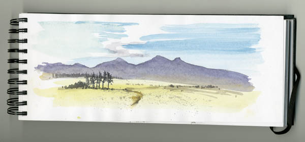
    The photograph shows typical Mid-Wales rolling countryside, the sort that the authorities wish to saturate - and I mean saturate, not just one turbine here and there, not just one wind farm here and there, but obliterate much that is dear to locals and tourists alike, so that all they will see is their hills and mountains through the massive, garish prison bars of the totally out-of-scale wind turbines that are far higher, far more intrusive, and completely alien to anything else in the natural landscape. It will destroy the economy of the region and force people into poverty.

   I grew up with a deep love for the countryside. I never questioned that one day it might be lost, that the greed of man, the voracious appetite to control the world by the corporations and their political acolytes might one day destroy our way of life. I have nothing but disgust for the Welsh Assembly and if you feel the same way please tell the first minster:   carwyn.jones@wales.gov.uk

   What would the world be, once bereft
   Of wet and wildness? Let them be left,
   O let them be left, wildness and wet;
   Long live the weeds and the wilderness yet.
                                  Gerard Manley Hopkins

Tuesday 7 June 2011

Demonstrations at Patchings Art Festival and Sandpiper Studio

     Jenny and I will be demonstrating at Patchings Art Festival http://www.patchingsartcentre.co.uk/ this Thursday, Friday and Saturday, and it's a marvellous place to enjoy art with demonstrations, artwork, art materials, crafts, exhibitions and so much more. With a brass band playing, the sun shining and so much to do it's an artist's heaven, so do try to come along and enjoy what's on offer.

    We will also be demonstrating at the Sandpipers Studio on the Wirral in Cheshire: Jenny on the afternoon of 24th June, and David will be demonstrating on the morning of 25th June plus a slide show after a lunch-break, with the opportunity to ask questions on both days.

   There is only limited space at the Sandpiper Studio so you will need to book in advance, either by telephoning Julie McLean on 07788 412 480  or by email  info@thesandpiperstudio.co.uk  Julie is very well organised and makes everyone very welcome.

    And don't forget................always carry a sketchbook around with you, as you never know when that truly exciting subject will appear, whether you are shopping, on a bus, birdwatching or riding a camel across the Empty Quarter.

Monday 6 June 2011

The Battle of Aberdod

    Today I've invited Griswallt ap Llechitwyt, author of 'The Grog Invasion' and an authority on the legendary Welsh water-folk, the Llandoddies, to regale us with a rare insight into these fascinating creatures. Grissie, as he is affectionately called, lives somewhere in the heart of the Cambrian Mountains, a recluse who makes occasional forays into the 21st century and has a further Llandoddie book in preparation.


     My involvement with the Doddies, or Llandoddies, as they come from Llandrindod Wells, goes back to the time when I first learned about the Battle of Aberdod. So amazing was the story of these legendary folk, I just had to put it down on paper. The picture illustrates a scene from the battle, which occurred on St Cewydd's Day in 1913, St Cewydd being the patron saint of rain. Here you can see the sense of despair on the faces of the little Doddies as they are being overwhelmed by the villainous Grogs who are intent on putting the Doddies to the sword, stealing their cakes and also the Doddie ladies who bake them.

     How can they possibly survive against such odds? Well, all is revealed in The Grog Invasion which you can get from http://www.davidbellamy.co.uk  Should you visit Llandrindod, or Llandod as it is known locally, be sure to look out for all the Doddie sculptures around the place: in the Rock Park, beside the lake and in the woods. Powys County Council are organising a Llandoddie walk this summer, and who knows, you might well come across one of the little folk if you are quiet, but beware of any Grogs that might lurk in the undergrowth!

    The second book in the series, Terror of the Trolls, is currently being written, but because much of the action takes place underground in the Rock Park it has not been easy to dig out the incredibly awful tale of these monsters from Howey, but for those who have read the first book you may be reassured that many of your old favourite characters make an appearance. I'll be back with more news before long.

Grissie

Wednesday 1 June 2011

Painting Snow-covered Mountains

      One of the really good aspects of working at the Hay Literary Festival is that we've had a lot of youngsters taking part in our short workshops, and several of them have produced excellent work. The language is also quite different, and to every technique I demonstrate the illuminating reply always comes back the same: "Cool!"

     I love opening the fantastic world of art and nature to students, and it's sad we're unlikely to see these youngsters again, for it would be lovely to see the enthusiastic ones progress their painting further. I don't do workshops for many reasons, preferring to run occasional courses where I can take folk out into the countryside and show them how exciting it can be working directly from nature.

      Today's tip takes us back into the mountains. So many times I have hiked across mountains through deep snow, up crags and gullies, and taken tremendous efforts to reach a scene to paint. This one, however, is in Snowdonia in North Wales where I simply got out of the car and sketched this view. In places like Snowdonia you don't always need to trek across mountain ranges to get that stunning subject!

     In the watercolour you will see how I've created the shadows with fairly strong ultramarine, while leaving the white of the paper to depict the snow highlights. A snow scene can look extremely cold and forbidding, though, unless you introduce some warmer colours. One of the obvious places to do this is in the sky, where I've laid Naples yellow and some alizarin crimson to warm it up. Had I pushed this further across to the right I could have also included some of these colours as reflections in the stream, but I was happy with the way things were. Beside the stream I've added bunches and strings of reeds with the warm yellow ochre, a useful colour to drop into the foreground of a snow scene to relieve the overwhelming cool - there's that word again. I'd better shut up!

     The painting features in my DVD on Painting Mountains & Moorlands, which is a series of slides covering a whole variety of scenery from valleys to the high peaks and glaciers, and available from http://www.davidbellamy.co.uk

Sunday 29 May 2011

Pastels, Watercolours & Vikings at Hay Festival

     Over the last few days Jenny and I have been demonstrating and running brief workshops at the Hay Festival in the shadows of the Black Mountains. This has been sponsored by Sky Arts in an endeavour to kickstart people's creativity, and it has meant that we are reaching a different audience. What has been really exciting is the number of youngsters taking part and enjoying themselves.


     The picture shows Jenny demonstrating her pastel-painting techniques, and in the short time available she produced a lovely landscape. Pastel, though needs careful handling when you are not used to it: somehow one young lady managed to get more pastel on her face than on the paper! However, they did some really good work, especially as so many were absolute beginners, all benefitting from Jenny's excellent teaching.

     I don't normally do workshops, and to attempt to shoe-horn them into 45 minutes or so is tempting fate. At times things became almost riotous, but everyone put in a marvellous effort to produce a finished painting. Alas, the brushes for the workshop had disappeared overnight, so we had to scratch a few together, not quite having to resort to a stick of rhubarb!

    We are lucky in being sandwiched between two marvellous acts - Opera Playhouse with Pippa Longworth and Karl Daymond, and Hip-Hop Shakespeare. Pippa has a stunning voice and looks quite formidable clad in Viking gear, complete with horned helmet as she launches into a Wagner piece, while Hip-Hop Shakespeare is a marvellously original way of interesting young folk in the works of the great bard.

     Jenny and I will be there again on 30th May, 3rd and 4th June, and will be delighted to see any of you who can come along.

Tuesday 24 May 2011

Stopping environmental destruction

      They came from Ceredigion, they came from Carmarthenshire, Denbighshire, Radnorshire, Snowdonia, from Shropshire, Devon, Cornwall, Cheshire, and many more places; but most of all from Montgomeryshire. They descended on Cardiff to protest against the destruction and industrialisation of the beautiful Mid-Wales countryside by over 600 wind turbines, with their associated tall pylons, substations and other structures. To protest against the gridlock of main Powys roads every weekday for six years or more, with the associated works of building new roads, bridges, and moving road furniture to carry massive turbine structures and thousands of tons of concrete for their bases, concrete production being one of the most polluting processes known to man. At the same time destroying peat blankets that store CO2, thus releasing the very thing these turbines are supposed to be reducing.


      Jenny and I travelled down with a coach-load of protesters. My first problem was when they handed out the song-sheet - no-one else on the bus appeared to be able to read Welsh, so Muggins had to blast away.....anyone who has witnessed my singing will recoil with the awful memory, and in the confines of the coach it must have sounded dreadful - I'm no Katherine Jenkins!  We're deeply concerned that it is clear that most of Mid-Wales will become one vast windfarm if these plans go ahead. We certainly would not want to walk and sketch amongst these useless structures. They would devastate the local economy that relies so much on tourism.

     This was the largest demonstration they had seen at the Welsh Assembly. All the political parties sent out a representative: Labour sent out a girl who had only been an AM for a couple of weeks, while her leader hid away in the Senedd; the Lib-Dem leader, an AM for Mid-Wales shamefully made no appearance; Plaid Cymru, the party whom one would expect to stand up for Wales, made it sound as though he'd fought on our side, which was patently not the case; only the local Conservative MP for Montgomery, the man who galvanised the growing protest movement, stood up for our glorious countryside. Most magnificent was Myfanwy from Meifod who tore into the Welsh Assembly with a ferocity and touch of humour that received a tremendous applause.

     But then, not to be outdone, stepped forward that wonderful organisation that strikes terror into the heart of any British government, should they step out of line - the WI. The representative from the Womens' Institute told the Welsh Ass in no uncertain terms that this wasn't good enough - a rethink on their energy strategy was necessary. Then, finally, as is always fitting in Wales, we all sang, and sang......

     Whether we are artists, walkers, riders, tourists seeking solitude and peace, or whatever, we need the countryside for our health, our sanity and to de-stress. Nothing works better than nature, but if we are not careful we have so much to lose now. If you feel you would like to sign the Welsh Assembly petition against these proposals please see http://www.assemblywales.org/gethome/e-petitions

Sunday 22 May 2011

Painting with Pastels

      Many people turn to pastel, that lovely rich, direct medium, after experiencing the horrors of watercolour, which seems to have a mind of its own, and sometimes it seems, a vindictive one. Pastellist Jenny Keal has just brought out a new book Painting With Pastels, a superb guide for both beginners and the more experienced artists. It is mainly concerned with landscapes, although she has included a number of flower paintings as well.


      Barafundle Bay in Pembrokeshire has a gem of a beach and in this painting Jenny has done it proud. She turns a good subject into an outstanding composition with a number of devices. Firstly, the long background cliff-top can intrude, but see how she has softened it off in places, introducing mist here and there with a judicious smudge. She has not been tempted by the cold, featureless sky, but has warmed it up to echo the foreground sand colour. All the background has been achieved in tones of grey, but she emphasises the power and solidity of the rocks with bold, determined strokes of a dark pastel that bring them closer to the viewer and thus creating a marvellous sense of space and distance.

      Pastel is a lovely medium for suggesting reflections in wet surfaces, and Jenny's rendering here has a mouth-watering quality, with lovely soft edges all round. One of her outstanding techniques with pastels is that of flaking - scraping the pastel stick and letting the droppings fall onto a selected area on the painting, then pressed in with a painting knife. Here you see the method used on the white splash, which truly brings the painting to life!

      I was with her when she did the original sketch on the beach, which is why I know how much she has tweaked the scene with the eye of the master painter. Her book is crammed with tips and techniques like this, and even if you do insist on sticking with the dreaded watercolour medium (as I do!), you will still learn a lot from this inspiring book, which includes a number of stage-by-stage paintings. Jenny will even sign it for you if you order it from our website http://www.davidbellamy.co.uk

Thursday 19 May 2011

Enlivening your landscapes


          There are a number of ways to enliven your landscapes, and in this watercolour of a farm in the English Lake District I have employed a few devices to add interest. A clothes line can be used to add colour and by not having the clothes hanging straight down you can give them a sense of being blown about - white, pink and red are excellent colours to use on the clothes. Just in front of the house I have emphasised blossom on the trees, and many of the trees around the house are bright green, adding to the feeling of spring and further drawing attention to the centre of interest, which is the house.

          However, once you include figures the centre of interest will then transfer to them, unless they are extremely small. The cyclists were not present, but I added them to bring life into the work. Always try and get your figures to be doing something, rather than standing around with their hands in their pockets, and for this try introducing some prop like a wheel-barrow, bucket, or as in this case, bikes. Finally, remember that sunshine will always liven up a painting.

          This watercolour is featured in my book David Bellamy's Mountains & Moorlands in Watercolour where I show the original sketch and photograph of the scene. For details of the book see:  http://www.davidbellamy.co.uk/

Sunday 15 May 2011

Blog followers and drawing figures

Some followers have told me they are not receiving automatic notification when I post a new blog. Hardly surprising if you are following a blogospheric idiot who doesn't know the difference between a geek and a slashdotter, however much he may know about watercolours. I'm sorry if you have had no joy with this, but I believe the problem is now sorted: on the top right of the blog page you will see a 'Follow by Email' slot. If you enter your email address there and click 'submit' that should hopefully ensure you are kept informed.

I'd like to take this opportunity to thank all of you who have become followers, left comments and sent emails about the blog, and I encourage you to leave comments as it helps me to find out what you like, or don't like. As I live a rather varied life, from the rip-roaring exciting bits to the boring ones, there will be a wide range of subjects and approach. Some may be completely mad, while others will cover serious topics, and of course a considerable amount of painting ideas, tips and information. It will be covering areas that often do not appear in my books and films.


This time I've included a sketch done many years ago of the Bedouin singer Abd Disardeq. I love figure work of all sorts and this was a delightful evening in Bahariah Oasis in the Western Desert of Egypt. In the sketch it may look as though Abd is playing music on an old chair-leg, but in fact it is a Bedouin musical instrument called a simsemeia. He is accompanied here by one of his sons. I painted a full watercolour from this, and kept it as it so reminds me of a wonderful evening in the company of many extremely kind and hospitable local people. So the lesson is: don't go anywhere without your sketchbook!